BRAND GUIDELINES

Logo

The logotype is a vital aspect of our brand identity, and it must be consistently displayed to maintain the integrity of the Oslobukta brand.

It should be versatile enough to be used across various media and material types, with the choice of style dependent on where it will be showcased. To ensure that the logo is well-represented in any setting, we have developed different versions

that can be adapted for print or digital platforms, providing design flexibility for different contexts.

LOGO EXCLUSION AREA

To maintain the logo’s prominence and authority, no elements should be positioned closer to it than the squared height of the lowercases.

Examples will demonstrate the appropriate utilization of the logo across various platforms.

LOGO MINIMUM SIZE

For optimal legibility, we suggest the following guidelines:

Print: The logo should not be smaller than 52 mm in width. When used on documents, it should be positioned at least 20 mm away from the edge of the page for a clear presentation.

Digital: The logo should have a minimum width of 150 pixels for digital use. When displayed on a website or other digital platforms, ensure it is placed at least 50 pixels away from the edge for visibility.

TAGLINE

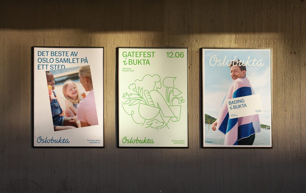
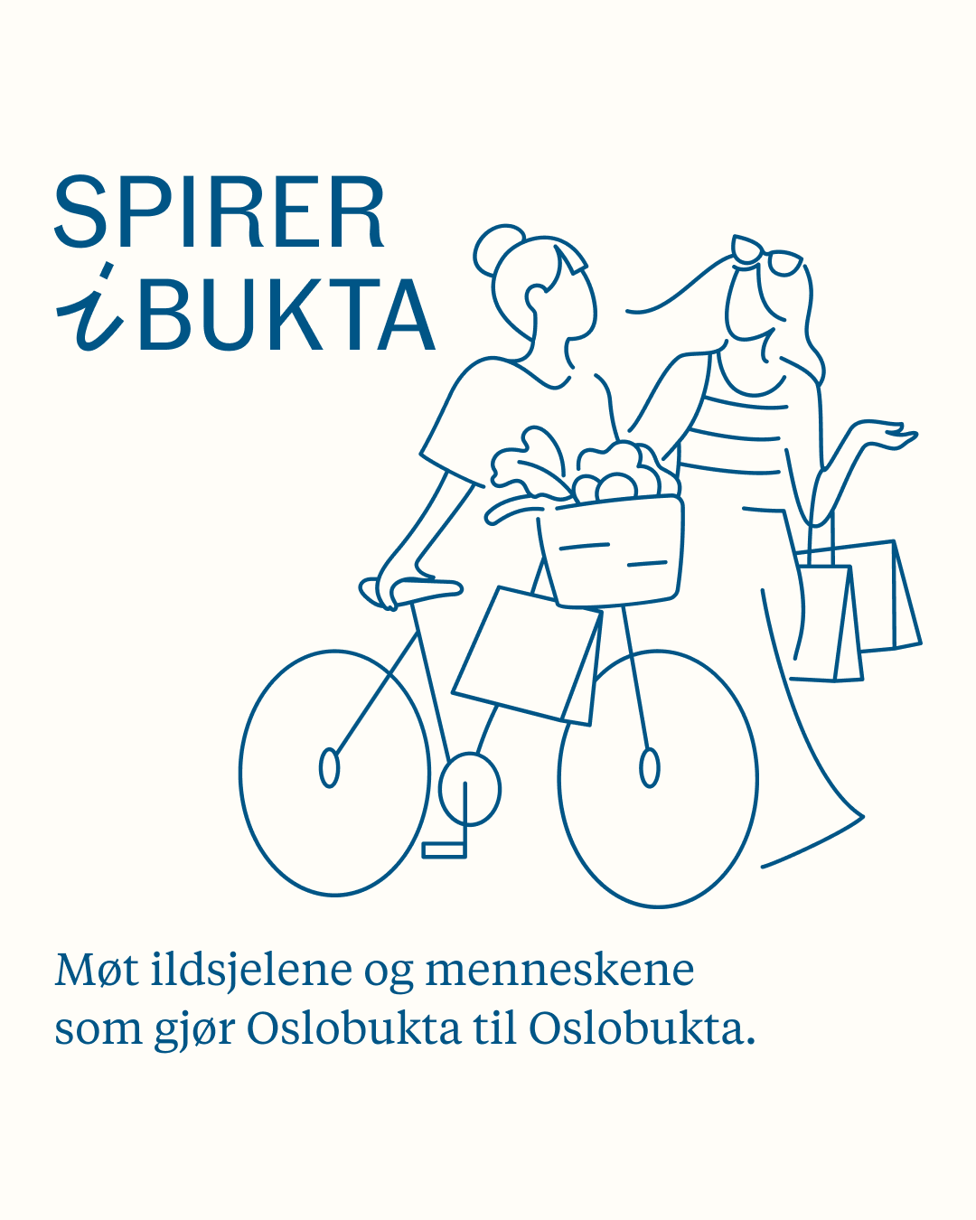
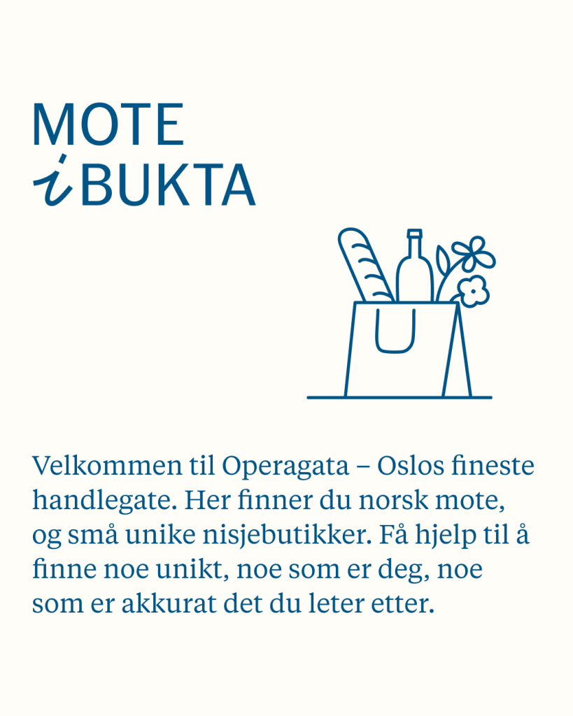
The tagline serves as a concise yet powerful statement that encapsulates the essence, values, and promises of a brand or identity.

It acts as a memorable and distinctive phrase that reinforces brand recognition.

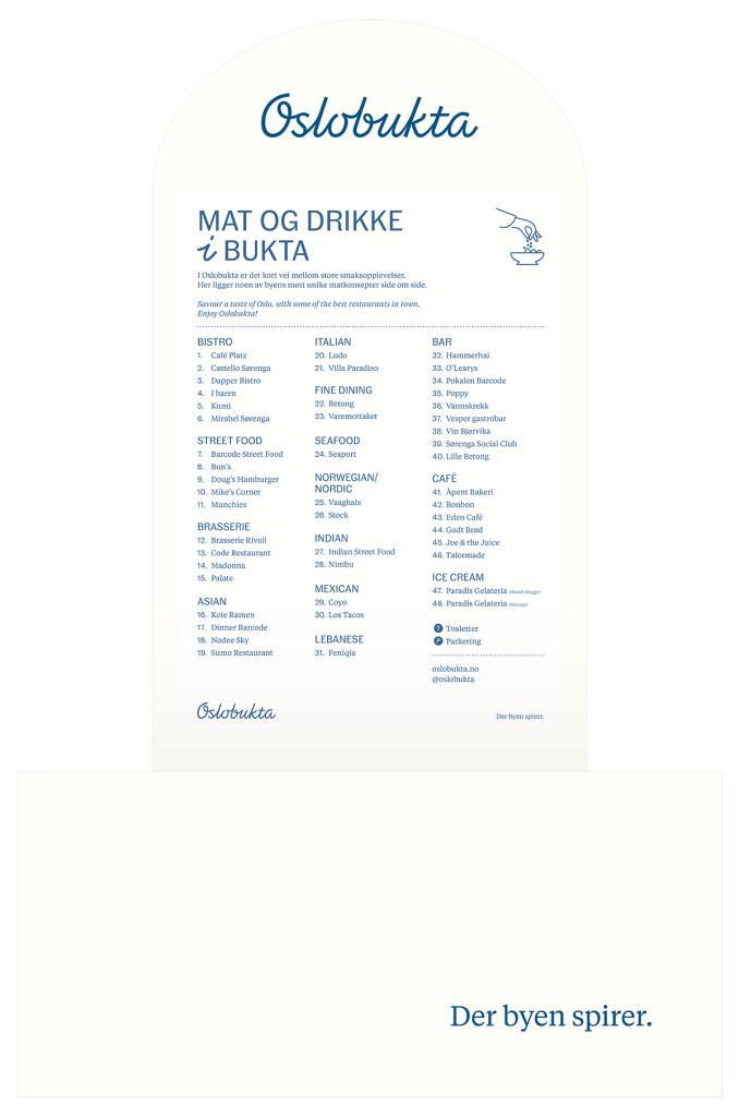
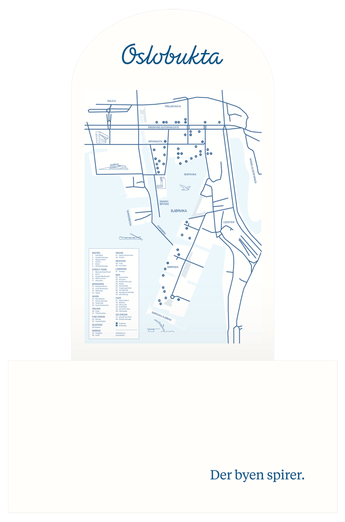
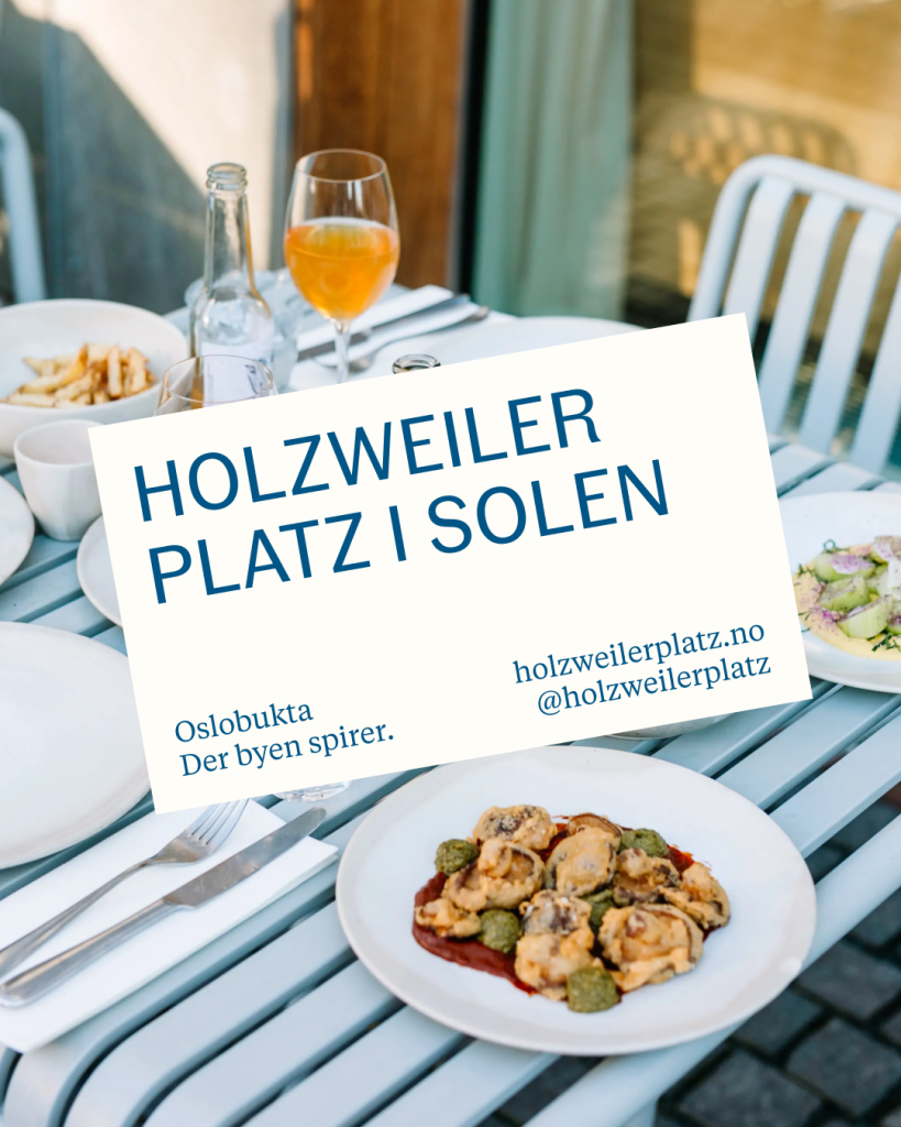
The phrase “Der byen spirer.” is consistently rendered in the brand’s designated font, Tiempos Text Regular, and remains untranslatable.

When the sentence is used independently, we use a period; however, when it is followed by additional information, the period is not needed.

Examples will demonstrate the appropriate utilization of the tagline across various platforms.

Der byen spirer.

Der byen
spirer oslobukta.no

TYPOGRAPHY

Fann Grotesque Regular is exclusively employed in uppercase for headings, while lowercase is reserved for smaller details and informations.

As for the secondary font, Tiempos Text Regular is utilized for the tagline and all text in both digital and print mediums.

Examples will demonstrate the appropriate utilization of the fonts across various platforms.

FANN GROTESQUE REGULAR

BESØK OPERAGATA

HEAVEN SCENT
OPERAGATA 45,
0123 OSLO

Generelle henvendelser
marked@carucel.no

Tiempos Text Regular

Det gode nabolaget — der byen spirer.

oslobukta.no
@oslobukta

I BUKTA

“I Bukta” is a communication concept that highlights the lively activities and distinctive attractions of Oslobukta. The ongoing refinement of its language aims to maximize catchiness, creating a memorable presence for social media.

We will offer the template for altering the action or activity while maintaining the “i bukta” layout.

ACTIONS:
SPISER, SPASER, LEKE, BADE, LUNSJ

SEASON AND ACTIVITIES:

PÅSKE, SOMMER, KONSERTER, ÅPENT GALLERI, MUSIKK, GATEFEST, JUL, PIKNIK…

COLORS

The main colors are a combination of PMS 7692 and a warm, natural white background or paper color.

In addition we’ve introduced a range of muted and refreshing background hues to complement matching corresponding colors. For example Light Blue background with Bright Blue text and illustration.

These are specifically designed for “I bukta” communication, whether in digital or print format.

Examples will demonstrate the appropriate utilization of the colors.

PAPER
CMYK: 0.0.2.0
#FFFDF8

PMS 7692
CMYK: 98.70.24.7
#005587

PMS 4162 25%
CMYK: 11.2.7.0
#EAF6FA

PMS 113 20%
CMYK: 0.2.15.0
#FFFFE8

PMS 3501 20%
CMYK: 11.2.13.0
#F2FFE5

PMS 2029 50%
CMYK: 4.14.14.0
#FFEBE1

PMS 299
CMYK: 79.9.0.0
#00AFE9

PMS 2013
CMYK: 0.39.100.0
#FAA819

PMS 3501
CMYK: 65.0.100.0
#62BB46

PMS 2029
CMYK: 0.59.37.0
#F48785

ILLUSTRATION

The introduction of icons, illustrations into the brand and communication helps tell a richer story of what of place Oslobukta is.

The illustration depict the various activities, shops and items that can be found within Oslobukta.

Examples will demonstrate the appropriate utilization of the illustrations.

All illustrations are developed by Darlig Clementine.

PHOTOSTYLE

Incorporating photography into the brand and communication enriches the narrative of what Oslobukta represents.

Illustrative instances will showcase the effective use of photography.

Hinda Fahre’s photographs, taken a few years ago, should be utilized with her consent for a start.

In the future, to further develop the brand, additional photos will need to be taken, and Studio Pfanzelter will collaborate with the photographer to create a photo brief.

APPLICATIONS

Information posters with custom maps gathering restaurants and shops in Oslobukta.

OSLOBUKTA COMMUNICATON

In Oslobukta’s communication strategy, maintaining a consistent layout is crucial for establishing a strong brand identity, while also incorporating a variety of layouts to sustain audience engagement.

Consistency fosters brand recognition and professionalism, building trust over time, while diversity in layout prevents monotony and keeps communication fresh and captivating.

By balancing these elements, Oslobukta effectively communicates its message, capturing and retaining audience attention while ensuring ongoing interest and relevance.

Templates are available in Adobe Illustrator.

SOCIAL MEDIA

Crafting a cohesive sociale media feed is crucial for communicating and reinforcing a brand’s indentity.

By incorporating the brand’s colors, fonts, logos, and visual style into social media content, each post becomes a representation of the brand’s personality and values. This consistency across the feed creates a sense of familiarity among followers and helps to strengthen brand loyalty. 

Furthermore, designing a social media feed with a consistent aesthetic enhances visual appeal and professionalism. Moreover, consistency in messaging is equally important. Each post should align with the brand’s voice and tone.

DIVERSE APPLICATIONS

Examples of employing identity elements and illustrations across diverse applications.

BRAND GUIDELINES

2025

For design related questions
please contact us:

Carucel eiendom:

marked@carucel.no

Studio Pfanzelter